Automated Reporting for Small Business: Save 17 Hours/Month
Spending 17 hours per month assembling reports by hand? Learn how to automate reporting in your existing tools in one afternoon—no consultant required.
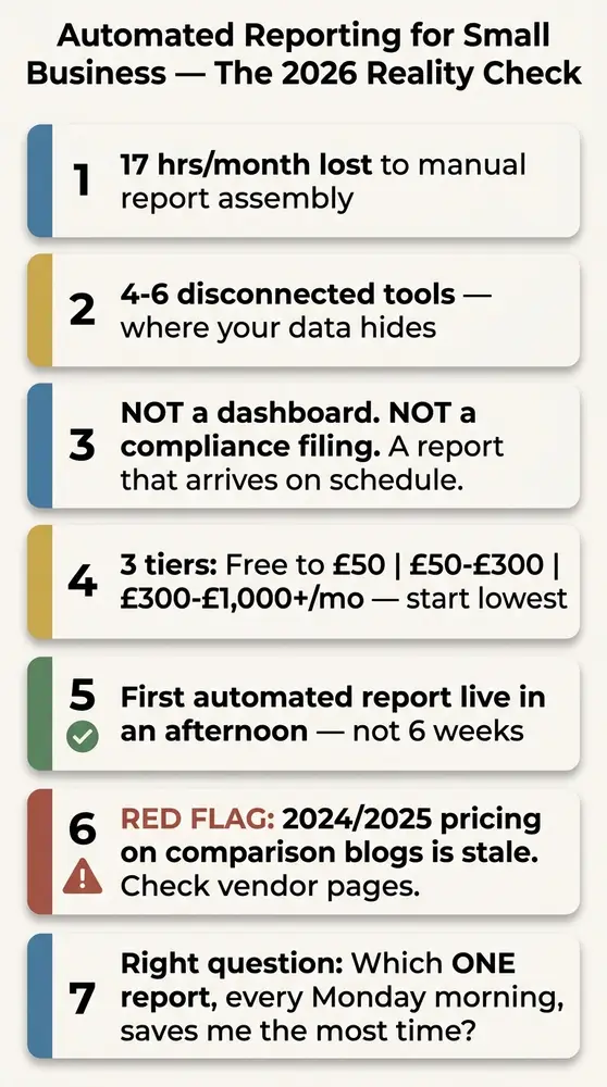
- Automated reporting means a system that collects data from your business tools on a schedule and produces a finished report without anyone assembling it by hand — it is not the same as a live dashboard, and it has nothing to do with federal compliance filings like the BOIR.
- Most small businesses already pay for tools (QuickBooks, Xero, HubSpot) that include built-in scheduled reporting features they have never switched on — the free tier is the right starting point for the majority of 5–50 person businesses.
- The three budget tiers in 2026 are: free to under £50 per month (native scheduled reports, Looker Studio), £50–£300 per month (mid-market connectors), and £300–£1,000+ per month (higher-tier platforms) — start in the lowest tier that can do the job.
- Any pricing figure from a 2024 or 2025 comparison blog should be treated as stale; always check the vendor’s own pricing page before committing to a subscription.
- A useful first automated report can be live in an afternoon — not a six-week vendor implementation — and the right starting question is not “which tool?” but “which one report would save me the most time if it arrived automatically every Monday morning?”
It’s Friday evening and you’re still at your desk. That’s the cost of not using automated reporting for small business — and it’s measured in more than just hours.
Research suggests small business owners lose an estimated 17 hours per month to manual reporting — more than two full working days, every month, gone to copy-paste. Not just time. Decisions made on data already three days old by the time anyone sees it, and key performance indicators (KPIs) quietly dropping off the radar because pulling the numbers takes too long.
What is automated reporting? (And what it is not)
No one assembles it. That’s the point.
Automated reporting is a system gathering data from one or more of your business tools on a schedule — daily, weekly, monthly — and producing a finished report without anyone assembling it. The report arrives in your inbox, a shared folder, or a Slack channel. You don’t have to open anything to trigger it.
No magic. No data engineers. Just a system doing the copying and assembling for you, on a timer.
Two things automated reporting is not — because confusion on both points is common.
A dashboard is not an automated report. A dashboard is a screen you open to look at live numbers — you go to it. An automated report arrives without you asking — it comes to you. Both are useful, and they solve different problems. A dashboard shows you the current state; an automated report shows change over time, delivered on a regular cadence to whoever needs it. You don’t have to remember to check a dashboard if the report is already in your inbox.
A scheduled report is the simplest form of automated reporting. Scheduled reports — one tool, one template, delivered on a timer — are already built into most accounting and CRM tools. Most small business accounts have these features and have never switched them on. That’s where this starts, not with a new platform.
Why manual reporting costs small businesses more than they think
Data silos are the root problem. Your data is scattered across 4–6 disconnected tools — accounting software, a CRM, a point-of-sale or e-commerce platform, Google Analytics, and ad-hoc spreadsheets. None of them talk to each other automatically.
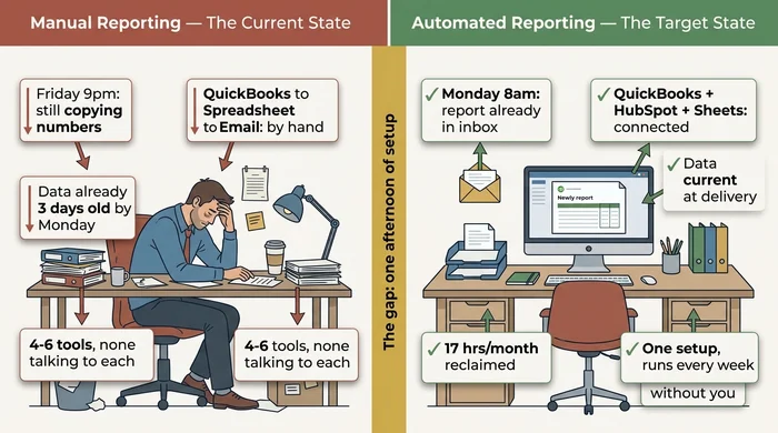
The time cost is real. 17 hours per month of manual reporting is the commonly cited figure. At owner-operator rates, that’s a significant cost before any tool subscription is factored in. But the decision quality cost is just as important. Reports assembled by hand on Friday afternoon from Thursday’s exports reflect data already stale. Decisions made on stale data are made at least partially blind.
There’s also the double-entry trap — entering the same transaction or lead into two systems (accounting software and CRM, for example) — which automated reporting doesn’t fully solve but will surface. Discrepancies previously hidden in the copy-paste process suddenly become visible. That’s a feature, not a bug, but it may trigger a deduplication task before your first clean automated report runs.
Automated reporting doesn’t require replacing your existing tools. It means connecting the ones you already have, or switching on the scheduled reporting features already inside them.
What to look for in an automated reporting tool
Five criteria matter for an SMB owner’s evaluation. Only five.
Does it connect to the tools I actually use? Not “500+ integrations” as a headline figure, but specifically: does it support QuickBooks Online or Xero, Shopify, HubSpot, and Google Analytics? A generic connector count doesn’t tell you whether your exact combination is covered. Check the integrations page for your specific tools before subscribing to anything.
Can I set it up myself, or does it require a developer? “No-code” is a marketing term varying significantly by tool. Some tools genuinely require no technical knowledge; others label themselves no-code but still expect you to understand SQL queries or API key management. Look for tools with pre-built report templates and guided setup for your specific data sources.
What does it cost per month in 2026 — and is there a free tier to test? Any tool requiring a sales call before you can see the pricing or run a trial is almost certainly above the SMB tier. Treat that as a signal to look elsewhere first.
How long does the first report take to set up? If a vendor’s onboarding documentation mentions 2–8 weeks as the expected timeline for a first report, that’s a red flag. A good SMB tool gets you live in hours, not weeks. The 2–8 week timeline refers to a full BI platform rollout across an entire organisation — not a first automated report for a 10-person business.
What happens when a data source changes? The maintenance burden is the hidden cost every tool glosses over. Integrations break when tools update their APIs. Report templates need adjustment when the underlying data changes. A realistic setup takes 15–30 minutes per month in maintenance for a stable configuration, plus a one-off fix of 1–2 hours every 3–6 months. Factor that in before choosing a tool requiring a developer to update.
The table below maps each scenario to a concrete action and the reasoning behind it — use it alongside the flowchart to confirm your path before shortlisting tools.
| Scenario | Action | Reasoning |
|---|---|---|
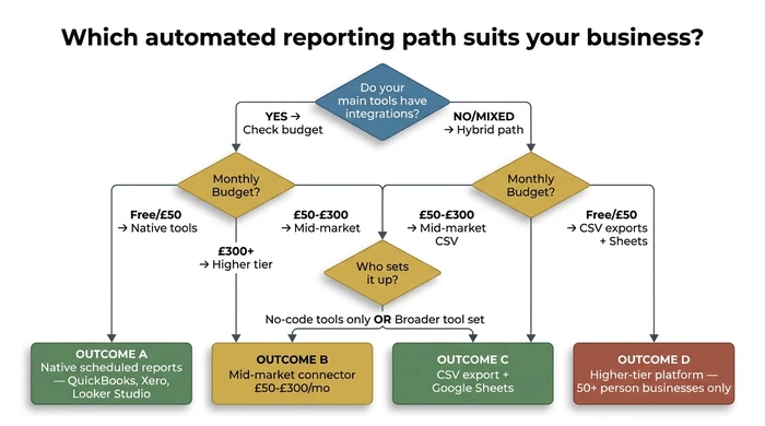
| Your main tools (QuickBooks, Xero, HubSpot) have integrations available, and your budget is under £50/month | Enable the scheduled report feature already inside the tool you pay for — no third-party tool needed | Most small businesses have never switched on the scheduled reporting built into QuickBooks or Xero. This is free, takes under 30 minutes, and requires no additional tool or vendor relationship. |
| Your main tools have integrations, budget is under £50/month, and your report needs data from more than one tool (e.g. Google Analytics + Sheets) | Use Google Looker Studio (free) to connect the sources and build a single automated report | Looker Studio connects natively to Google Analytics, Google Sheets, and several CRM data sources at no cost. It has a setup learning curve but no subscription fee and no vendor lock-in. |
| You have integrations on main tools, budget is £50–£300/month, data is spread across 3+ tools, and one team member can spend 2–8 hours on setup | Shortlist 2–3 mid-market SMB connectors, verify your exact tool combination is supported, then trial the one with the lowest setup barrier | Mid-market tools automate cross-platform data collection without requiring SQL or a data engineer. Verifying your specific stack is supported before subscribing avoids the most common failure point: paying for a tool that does not connect your actual tools. |
| You have a mix of API-connected tools and legacy software or spreadsheets with no integration | Use a hybrid path: automate the CSV export from legacy tools, import to Google Sheets on a matching schedule, then connect Sheets to your reporting tool | Not every tool has an API. Scheduled CSV exports are the practical starting point for legacy software. Automating the export step captures most of the time saving even without a full integration, and the data lands in Sheets where most mid-market connectors can reach it. |
| Your business runs primarily on spreadsheets with no API-connected tools and budget is under £50/month | Set up Google Sheets with Zapier (free tier) or Apps Script to automate data pulls and schedule a Looker Studio report on top | Spreadsheet-first businesses can achieve meaningful automation without buying any new software. Zapier's free tier handles simple triggers; Apps Script handles more complex Sheets automation. Looker Studio then delivers the finished report on schedule. |
| Budget is £300+/month, team is 21–50 people, you have a team member dedicated to data management, and you have outgrown mid-market tools | Evaluate higher-tier platforms (Power BI Pro, Domo entry tier) only at this stage — treat them as a step up from mid-market, not a starting point | Higher-tier platforms require dedicated setup, ongoing maintenance, and often a paid implementation partner. They are the correct answer for complex, multi-stream reporting at scale — not for a business setting up its first automated report. |
| You searched "automated reporting" because you received a notice about a federal filing obligation (BOIR, CTA, GSA/FPDS) | Stop here and go to FinCEN's official guidance at fincen.gov/boi or GSA.gov — operational reporting tools do not file compliance reports | BOIR/CTA filings and federal procurement reporting (GSA/FPDS) are legal obligations handled through official government portals, not business intelligence tools. Using the wrong category of tool for a compliance filing carries legal risk. |
| A tool markets itself as "AI-powered reporting" and charges a premium for it | Ask specifically what the AI does — if it is scheduling and templating, it is not AI; if it writes plain-language summaries of report data, that is a real AI feature worth evaluating | Most automated reporting tools use scheduled queries and pre-built templates — the same approach that has existed for decades. That is still genuinely useful. Paying an AI premium for what is functionally a cron job is not a justified cost. |
| You have found 2024 or 2025 pricing figures on a comparison blog and are about to make a decision based on them | Treat those figures as a reference range only — go directly to the vendor's current pricing page before committing | Pricing in this category shifts every 6–12 months. Half the top search results for this topic carry figures that are at least 12–15 months out of date. Subscribing based on stale pricing is the most avoidable mistake in this buying process. |
The 2026 SMB automated reporting tool shortlist
Start in the lowest tier doing the job. Moving up is easy; paying for complexity you can’t use is expensive.
The three tiers below group tools by what a small business can realistically afford and operate in 2026.
Use the decision sheet below to match your profile to a shortlist in under five minutes.
The 2026 SME Automated Reporting Decision Sheet
Step 1 — Answer these five questions:
| # | Question | Your Answer |
|---|---|---|
| 1 | Team size | 1–4 / 5–20 / 21–50 |
| 2 | Tools you already pay for | QuickBooks Online / Xero / HubSpot / Salesforce / Shopify / Google Analytics / Excel or Sheets only |
| 3 | Monthly budget available | Under £50 / £50–£300 / £300–£1,000 / £1,000+ |
| 4 | Who will set it up | Me (no tech background) / A team member (some tech comfort) / We will hire help |
| 5 | Primary reports needed | Financial (P&L, cash flow, AR) / Sales pipeline / Marketing performance / Operational KPIs / Mix of these |
Step 2 — Match your profile to a tier:
| Profile | Suggested Tier | Tools to Shortlist | Realistic Setup Time | Red Flag to Watch |
|---|---|---|---|---|
| Team 1–20, budget under £50, setting it up yourself, financial or single-source reporting | Free / Native Tier | QuickBooks Online scheduled reports, Xero scheduled reports, Google Looker Studio | 20 min–3 hrs for first report | Do not pay for a mid-market tool until you have switched on the scheduled reporting already inside the tool you pay for — most small businesses have never touched it. |
| Team 5–50, budget £50–£300, one team member available for setup, data across 2–3 tools | Mid-Market Tier | Looker Studio + Zapier, Make (formerly Integromat), or a dedicated SMB connector (verify 2026 pricing directly with vendor) | 2–8 hrs across 2–3 sessions | Confirm your specific tool combination (e.g. QuickBooks + Shopify + a spreadsheet) is supported before subscribing — “500+ integrations” does not always include your exact stack. |
| Team 10–50, budget £50–£300, mix of tech and non-tech, cross-platform reports needed | Mid-Market Tier | Mid-market SMB reporting platform (verify current pricing at vendor site — 2024/2025 figures are stale) | 4–8 hrs | If a vendor quotes a 2–8 week implementation timeline for your first report, that is a red flag. Your first automated report should be live in days, not weeks. |
| Team 21–50, budget £300+, willing to hire part-time help, full cross-tool reporting | Higher Tier | Power BI Pro, Domo (entry tier), or equivalent — evaluate only after outgrowing mid-market | 1–4 weeks with setup help | These platforms require dedicated maintenance. Factor in ongoing cost of a team member or part-time contractor before committing. |
| Any size, tools have no APIs or integrations (legacy software, bespoke systems) | Scheduled Export Path | Google Sheets + scheduled CSV exports + Zapier free tier | 1–4 hrs to build the export workflow | This is a manual bridge, not a fully automated pipeline. It is still a significant improvement over copy-pasting by hand, but plan for 15–30 min of monthly upkeep. |
| Any size, looking for BOIR/CTA, GSA/FPDS, or OMB compliance reporting | Different topic entirely | See FinCEN official guidance at fincen.gov/boi or GSA.gov for procurement reporting | N/A | No operational reporting tool replaces a legal compliance filing. You are looking for a different category of tool. |
Step 3 — Your starting action: pick the single report arriving automatically every Monday morning would save you the most time this week. Set that one report up first. Add a second only after the first runs cleanly for two weeks.
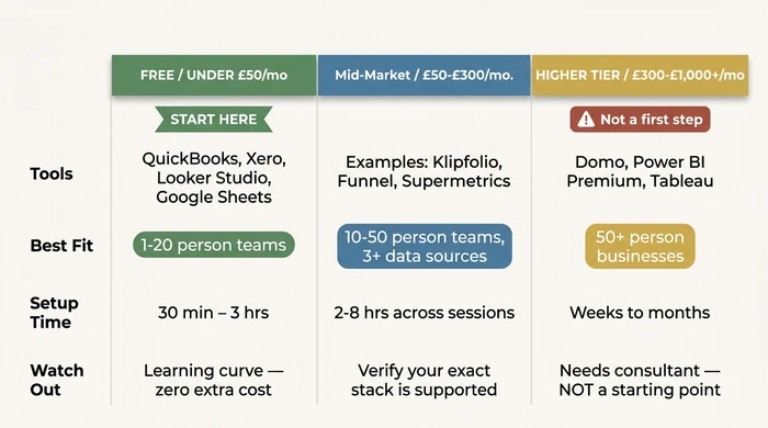
Free tier / under £50 per month
This is where the majority of 5–20 person businesses should start — and where most will stay. The tools are ones you already pay for.
QuickBooks Online and Xero both include scheduled report delivery built into the platform. Standard financial reports — profit and loss, cash flow, accounts receivable ageing — can be scheduled to arrive in your inbox on a weekly or monthly basis at no additional cost. Most accounts have this feature sitting unused in the settings menu. Log in, find the Scheduled Reports or Email Reports section, choose the report, set a delivery frequency, and add the email addresses. First report: under 30 minutes.
Google Looker Studio is a free tool from Google connecting to Google Analytics, Google Sheets, and a range of CRM data sources. If your reporting need involves multiple sources — marketing data from Google Analytics plus financial data from a Sheets export — Looker Studio is the lowest-friction option at no additional cost. Expect a learning curve of 1–3 hours for the first report. Zero vendor lock-in. No subscription fees.
Google Sheets with Zapier’s free tier handles lightweight automation where data is already living in spreadsheets. The free Zapier tier allows basic triggers and automated data pulls between tools. Apps Script (built into Google Sheets) handles more complex automation for users comfortable with basic scripting.
Honest note: these tools require some manual configuration. Looker Studio isn’t a plug-and-play experience. But for a business with straightforward reporting needs and a limited budget, the setup investment pays back in the first month.
Mid-market tier / £50–£300 per month
Mid-market tools automate cross-platform data collection without requiring SQL or a dedicated data engineer. This is the right tier for a 10–50 person business with data spread across three or more tools not natively integrated.
Tools in this tier — including platforms such as Make (formerly Integromat) for workflow automation and various dedicated SMB reporting connectors — typically offer drag-and-drop report builders, pre-built connectors for common SMB stacks (QuickBooks, Xero, Shopify, HubSpot, Google Analytics), and scheduled delivery to email or Slack.
A critical note on pricing: figures from 2024 and 2025 comparison articles are stale by 12–15 months for many tools in this category. Pricing in mid-market reporting software changes frequently. The ranges cited here reflect publicly listed prices as of early 2026. Always verify on the vendor’s current pricing page before subscribing. Don’t budget based on a number you found on a comparison blog.
The most common failure point in this tier: paying for a tool not actually supporting your specific combination of data sources. “500+ integrations” as a headline figure doesn’t guarantee QuickBooks Desktop (not Online), your specific POS system, or a bespoke piece of legacy software is covered. Check the integrations page for your exact tools, and ideally run a free trial with your actual data before committing.
Best fit: teams with a team member who can invest 2–8 hours across a few sessions for initial setup, and reporting needs spanning three or more tools.
Higher tier / £300–£1,000+ per month
Higher-tier platforms — Domo, Power BI Premium, Tableau Server — are the right answer when you’ve genuinely outgrown the mid-market tier. They are not a starting point.
These platforms are built for organisations with 50+ employees, multiple revenue streams, and a team member whose job description includes data infrastructure. Deploying one in a 5–50 person business without that foundation means paying for complexity you can’t use, spending weeks on setup before seeing any value, and depending on a consultant for every subsequent change.
Evaluate them as a growth path, not an option — when mid-market tools no longer cover the complexity of the business.
Integration reality: what works with your existing stack
The data-silo problem has a practical path through it — but only if you’re honest about what your tools can and cannot do.
QuickBooks Online and Xero both have well-supported integration ecosystems. Most mid-market reporting tools connect natively to both. If you’re on QuickBooks Desktop (not the Online version), integration options are more limited — this matters for older businesses still on the desktop product and is worth checking before shortlisting any tool.
Shopify has a strong API ecosystem. The Shopify plus QuickBooks Online combination is a well-trodden integration path covered by most mid-market connectors. If your business runs on Shopify and a cloud accounting tool, cross-platform reporting is achievable at the mid-market tier without custom development.
HubSpot’s native reporting is strong for CRM and marketing metrics within its own ecosystem. The challenge is combining HubSpot data with financial data from a separate accounting tool — this typically requires a mid-market connector or a manual bridge. HubSpot reports and QuickBooks reports in the same document is not a free-tier task.
Google Analytics (GA4) connects natively to Looker Studio at no cost. Most mid-market tools also support it. If website traffic data is part of your reporting need, this is one of the easier integrations to solve.
Legacy software and no-API tools are where most SMB guides go silent. If your main tool is older accounting software, a bespoke system, or any tool without an integration marketplace listing, your starting point is scheduled CSV exports. Set a recurring export from the legacy tool, import to Google Sheets on a matching schedule, and connect Sheets to your reporting tool. It’s a manual bridge, not a fully automated pipeline — but significantly better than copy-pasting by hand, and it captures most of the time saving.
The business automation guide for SMEs covers the broader question of connecting disconnected systems, if you want to understand the full picture before committing to a reporting-specific tool.
How to set up your first automated report (no IT required)
Your first automated report should be live this week. Not after a six-week vendor implementation. This week.
The six-step process below applies whether you’re using a free tool inside your existing stack or a mid-market connector.
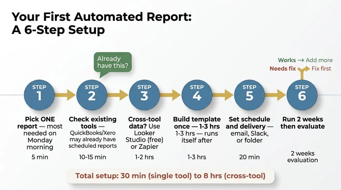
Step 1: Pick one report, not a full dashboard.
Start with the single report arriving automatically every Monday morning would save the most time. For most small businesses this is either a weekly cash flow summary or a weekly sales pipeline update — not both. The temptation is to automate everything at once. Resist it. One report, working cleanly, is worth more than ten reports configured badly.
Step 2: Check what you already have.
Log into QuickBooks or Xero and look for “Scheduled Reports” or “Email Reports” in the settings. Most accounts have this feature and it has never been switched on. If the target report is available there, you’re done — enable it and move on. Don’t buy a third-party tool to do something your existing software already handles.
Step 3: If your report needs data from more than one tool, pick a free connector.
Looker Studio connects to Google Analytics, Google Sheets, and some CRM data at no cost. If your data is already in Sheets, Looker Studio is the lowest-friction next step. For lightweight automation where data needs to move between tools first, Zapier’s free tier handles basic triggers without any coding.
Step 4: Build the report template once.
A report template defines which numbers appear where. You build it once; the tool populates it with fresh data on your chosen schedule. Expect to invest 1–3 hours on your first template. That’s the one-time setup cost. Every subsequent delivery is automatic.
Step 5: Set the schedule and the delivery method.
Daily, weekly, or monthly — choose the frequency matching how often the report is actually used. Choose where it arrives: email inbox, a shared Slack channel, or a folder. Test it manually before enabling the schedule. Confirm the data looks correct before automating the delivery.
Step 6: Run it for two weeks, then evaluate.
Does the report arrive on time? Is the data accurate? Is it actually being used to make decisions? If yes to all three — expand. If not, fix the weakest point before adding more reports. Adding a second report on top of a broken first report doubles the problem, not the value.
When your tools have no APIs (the legacy software path)
Some small businesses run on older software unable to connect to modern reporting tools. The practical path: most older software can export a CSV on a timer or with a one-click export. Automate or schedule that export, import the CSV to Google Sheets on a matching schedule, and connect Sheets to your reporting tool. It’s a hybrid process, not a fully automated pipeline, but it eliminates the majority of the manual assembly time.
Variations and exceptions
1–4 person businesses with a tight budget: The advice in this article still applies, but the tool tier skews free or under £30 per month. QuickBooks or Xero scheduled reports plus a Google Sheets trigger covers most needs at this size. Do not pay for a mid-market tool until you have outgrown the native options.
Regulated industries (healthcare, finance, legal): Check data residency requirements before connecting tools via a third-party reporting platform. Some connectors route data through US or EU servers; this may conflict with HIPAA or GDPR obligations. Your compliance contact should sign off before enabling any third-party integration.
“AI-powered” reporting tools: Ask specifically what the AI does. Most automated reporting tools use scheduling and templating — the same approach that has existed for decades, and it is still genuinely useful. Some newer tools use language models to write plain-language summaries of report data; that is a real AI feature worth evaluating. Do not pay an AI premium for what is functionally a scheduled export.
2024 or 2025 pricing on comparison sites: Treat it as a reference range only. Pricing in this category moves every 6–12 months. Always confirm on the vendor’s own pricing page before subscribing.
FAQ
Q: What is the best free automated reporting tool for small businesses?
Start with the scheduled reporting built into QuickBooks Online or Xero — most subscribers have never enabled it, it’s free, and it delivers standard financial reports directly to an inbox in under 30 minutes of setup. For cross-tool reporting combining data from Google Analytics, Google Sheets, or CRM sources, Google Looker Studio is the most capable free option, though it has a setup learning curve. Google Sheets combined with Zapier’s free tier works for lightweight use cases where data needs to move between a small number of tools.
Q: How do I automate my business reports without coding?
Use tools offering pre-built report templates and native integrations with your existing tools. QuickBooks, Xero, and HubSpot all include scheduled reporting with no coding required. Mid-market tools in the £50–£300 per month range typically offer drag-and-drop report builders. The only scenario where technical knowledge becomes relevant is when pulling from a tool with no native integration — in which case Zapier or Make bridges the gap without requiring any code.
Q: What is the difference between automated reporting and a dashboard?
A dashboard is a screen you open to see live data. An automated report arrives on a schedule without you opening anything. Both are useful, but they answer different questions: a dashboard shows the current state when you look at it; an automated report shows change over time, delivered to whoever needs it, whether they remember to check or not.
Q: How much does automated reporting software cost for a small business?
Three tiers apply in 2026: free to under £50 per month (native tools, Looker Studio); £50–£300 per month (mid-market connectors); £300–£1,000+ per month (higher-tier platforms). Most 5–50 person businesses start and stay in the first or second tier. Treat any pricing figure from a 2024 or 2025 comparison article as a rough reference only — always check the vendor’s current pricing page before committing.
Q: Can I automate financial reporting with QuickBooks or Xero?
Yes. Both platforms include built-in scheduled reporting for standard financial reports — profit and loss, balance sheet, cash flow, accounts receivable ageing. Log in, navigate to the Reports or Scheduled Reports section, choose the report, set a delivery schedule, and add the recipient email addresses. This is free, included in your existing subscription, and takes under 30 minutes to configure. For reports combining QuickBooks or Xero data with data from another tool (HubSpot, Shopify, Google Analytics), you’ll need a connector — refer to the tool shortlist section above.
Stop assembling reports. Start receiving them.
You have the full picture now. What automated reporting actually means, how to match your budget and tools to the right tier, and exactly how to get your first report live without hiring anyone or spending weeks on setup.
The path is clear. Check whether your existing tools already have scheduled reporting you’ve never enabled — for most businesses, that solves 80% of the problem at zero additional cost. Cross-tool reporting? Looker Studio is the free next step. Need something more capable? Mid-market covers most 5–50 person businesses for £50–£300 per month. Enterprise platforms exist for when you genuinely outgrow that.
One report. This week. Pick it now — which report, if it arrived automatically every Monday morning, would save you the most time? That’s your starting point.
If you want to understand how automated reporting fits into a broader business automation strategy for SMEs, that guide covers the full picture — from data silos and integration decisions through to the workflows worth automating next.
Founder, Too Many Hats
Free tool
What it's costing you
See how many hours your manual tasks are really costing you.
Free tool
Problem Solver
Describe your biggest timewaster and get a personalised plan.